


A Symbol Reborn
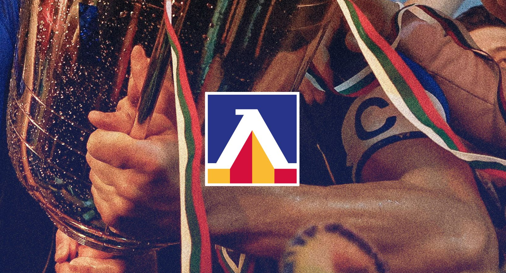
The air in Sofia is thick with anticipation as PFC Levski Sofia steps boldly into a new era. The club has officially unveiled a redesigned emblem, a move that sends ripples through the heart of Bulgarian football. This is not a mere tweak; it is a transformation. The iconic "L," a symbol etched into the soul of generations, has been refined, sharpened, and stripped of its textual baggage. The words "Sofia" and "1914" are gone, not erased, but elevated into standalone symbols of trust and history.
The vision behind this change is clear: preserve the soul while sharpening the edge. The new logo is a distillation of the club’s most recognizable historical models, crafted to carry the weight of the past while meeting the demands of the modern digital age. It is cleaner, stronger, and ready to dominate every screen, jersey, and banner it touches.
Listening to the Faithful
This was not a decision made in a boardroom vacuum. The process involved extensive dialogue with fan groups, associations, and the broader Levski community. As Hristo Gurtsov of Fauna Studio noted, the challenge was convincing supporters that removing text was not an act of denial, but of confidence. "Levski is a family and a religion," he said. "Eternity is not defined by years. A true Levski fan does not need to explain where they are from or when they started."
The new visual system includes custom typography, a defined color palette, and strict brand guidelines. From jerseys to tickets, social media to stadium signage, every touchpoint will now reflect a cohesive, powerful identity. The transition will be gradual, with the new emblem likely appearing on match kits for the 2027/2028 season. Full integration will take at least a year, ensuring a smooth and respectful passage into the future.
A New Standard
Kliment Yonchev, the club’s Communications Director, emphasized the responsibility of this task. "We had to perfect every detail," he said. "The presentation today is just the next step. The full adoption of this new visual system will take time, but we are committed to excellence."
Viktor Viktorov, Marketing Director, added that new elements, including a standalone "1914" symbol, will be used for merchandise. This allows fans to celebrate the club’s founding year in a fresh, versatile way. The goal is consistency, clarity, and a brand that speaks volumes without saying a word. Levski is not just changing its logo; it is redefining its presence for a new generation.


levski sf pro menha novata emblemata tbh. ne mi se vi kato prehraniat 1914 godinata ot samoto logo. no vseki ima pravo na vkus i na vkusove ne se sporat...